SPLUNK INTERNSHIP - SUMMER 2025
SPLUNK INTERNSHIP - SUMMER 2025
Designing a standardized Phone Number Input for Splunk's Design System
Designing a standardized Phone Number Input for Splunk's Design System

TIMELINE
TIMELINE
12 Weeks (May - August)
12 Weeks (May - August)
KEY RESPONSIBILITES
KEY RESPONSIBILITES
User interviews, Research, Design, Testing
Design & Research
TEAM
TEAM
Vyom Sethia, Abdou Sow, Catalina Manea, June Park
Vyom Sethia, Abdou Sow, Catalina Manea, June Park
TOOLS
TOOLS
Figma, React
Figma, React
CONTEXT & BACKGROUND
Splunk needed consistency at scale.
Splunk is used worldwide by enterprise teams, but there was no standardized phone number input in its design system. Teams patched things together with third-party components that lacked flexibility, accessibility, and scalability — creating inconsistent user experiences and wasted engineering effort.

THE PROBLEM
Inconsistent solutions created inefficiency.
Without a single standard, every product team implemented phone inputs differently. Some used third-party libraries, while others built ad hoc solutions from scratch. These approaches were inflexible, introduced accessibility issues like poor keyboard navigation and weak screen reader support, and required engineers to duplicate effort. A unified component was clearly needed.

RESEARCH & DISCOVERY
Understanding needs through stakeholder interviews.
I began by interviewing designers and engineers across Splunk to understand how phone inputs were being used. The conversations highlighted consistent needs: a country code selector (with optional flag icon), auto-formatting to reduce errors, and strong accessibility support. Beyond features, stakeholders emphasized the importance of flexibility — the component had to adapt to different workflows without forcing workarounds.


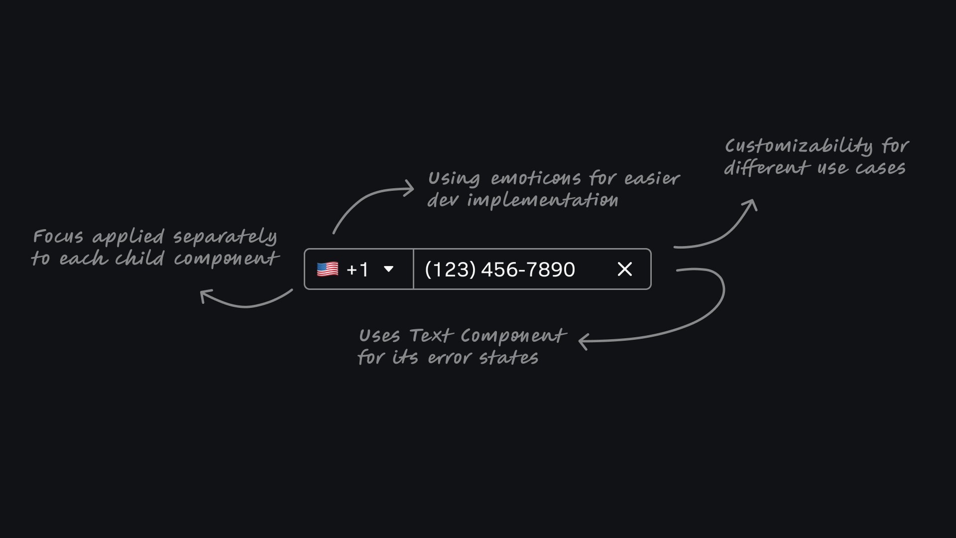
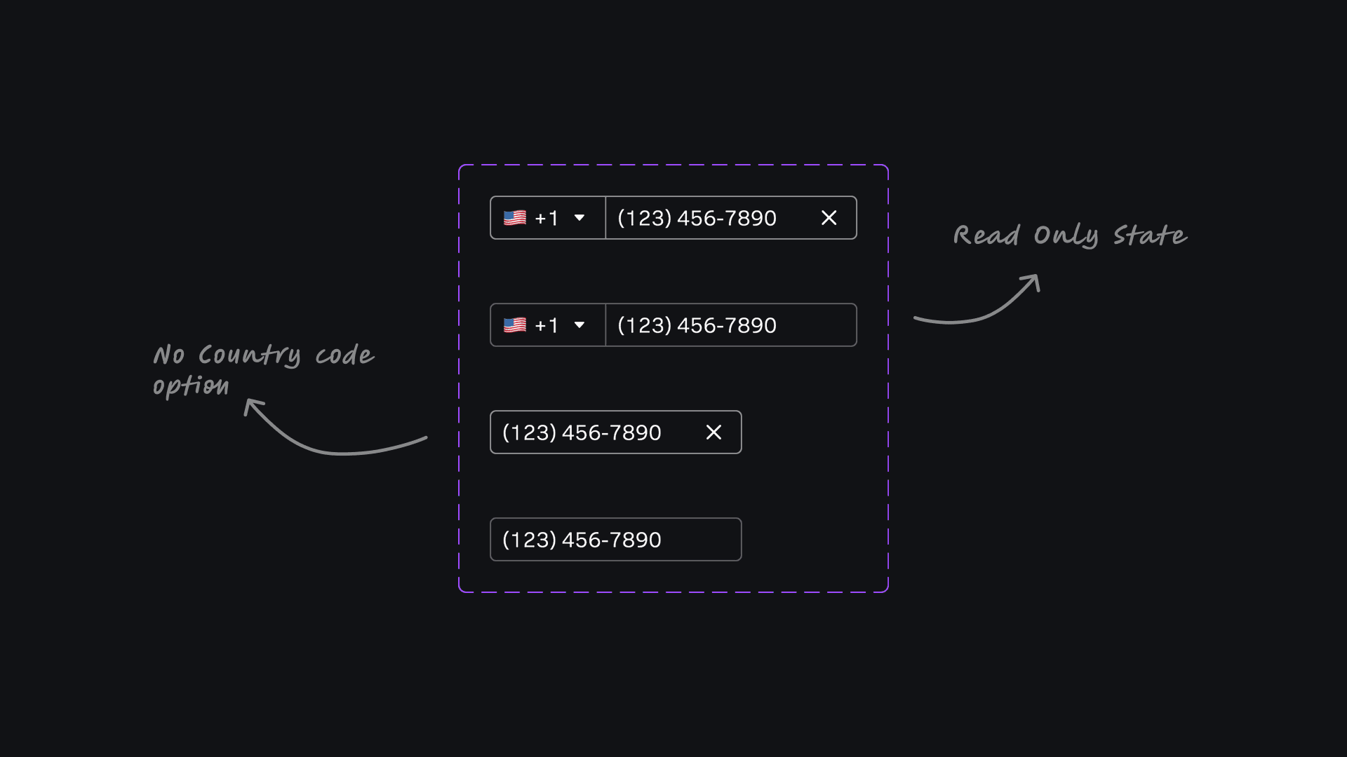
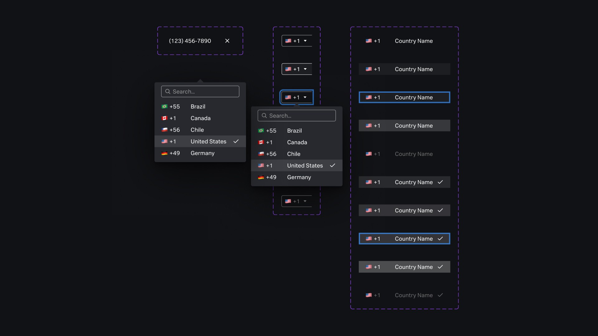
DESIGN & ITERATION
Exploring multiple approaches and refining.
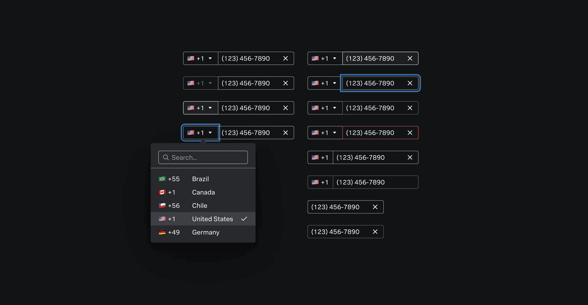
I explored and tested different approaches:
Split fields for country code and number (rejected for complexity)
Variations of focus states and dropdown behaviors
Different ways to display flags
Read-only and no-country-code use cases
Through iterations and critiques, I refined the design to balance usability, system guidelines, and technical feasibility.
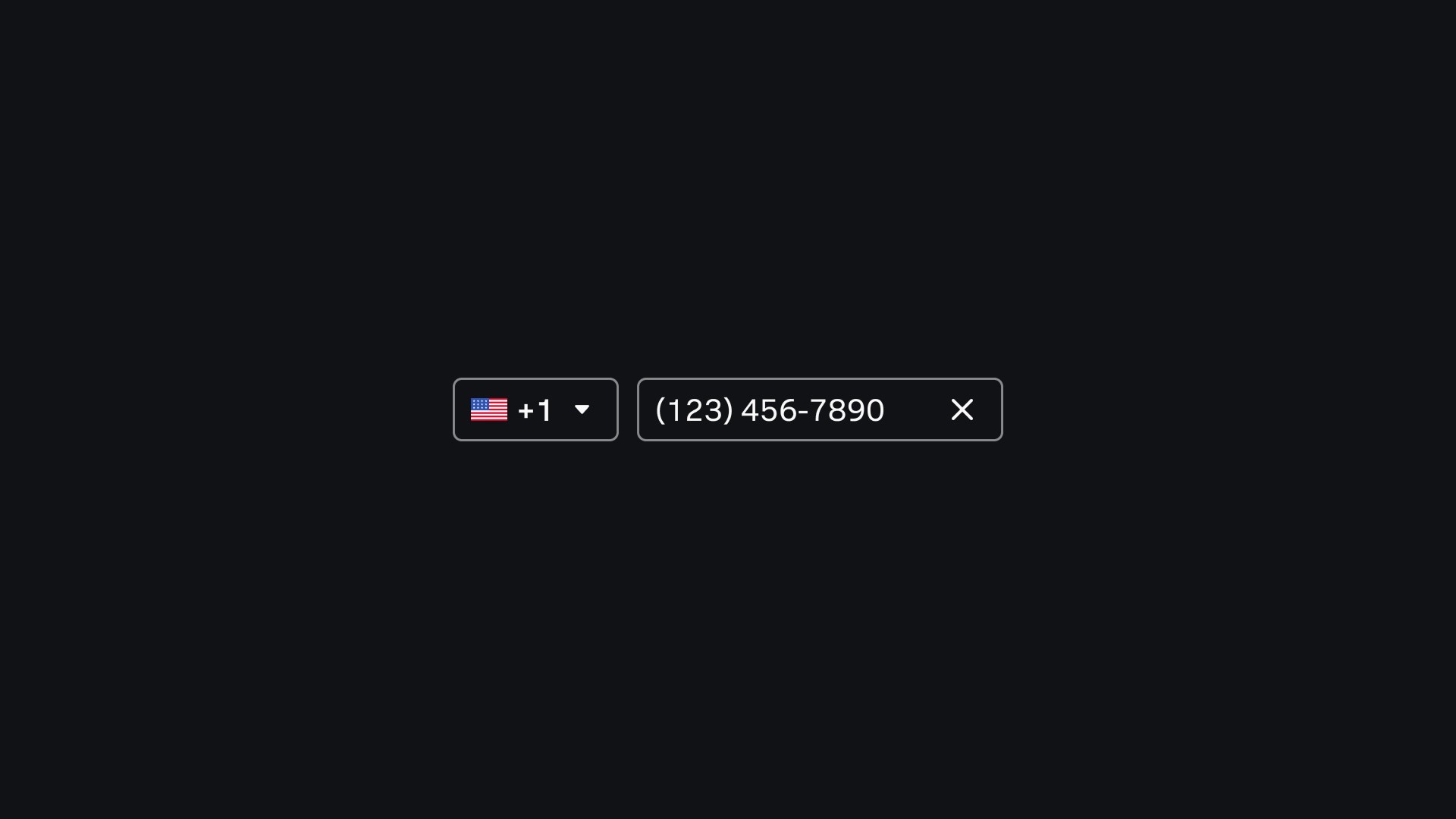
THE SOLUTION
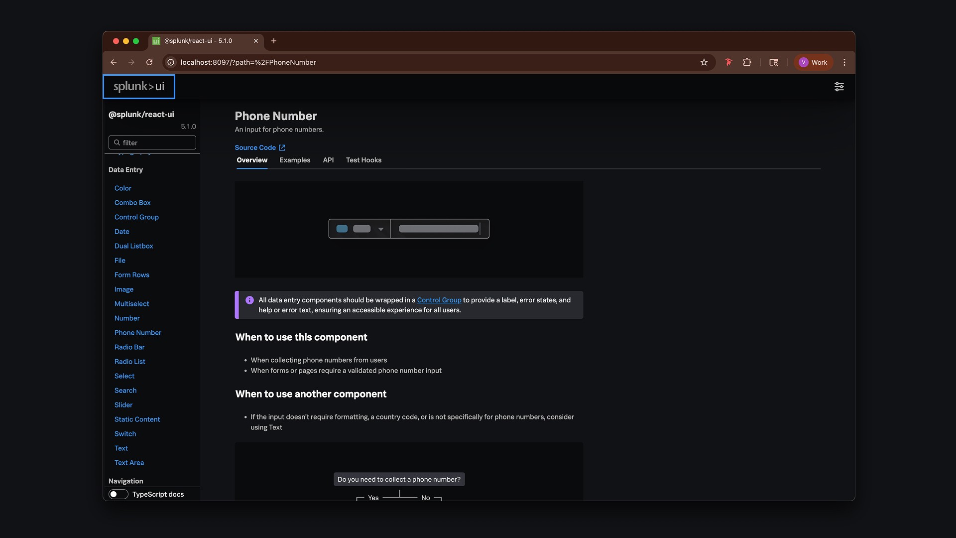
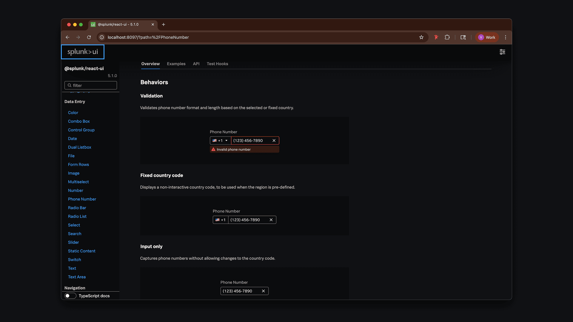
A standardized, accessible phone input for Splunk UI.
The final component unified functionality into a single, reusable design: keyboard and screen reader accessibility were supported by default, country code and flag options were configurable, and read-only and custom modes gave teams flexibility. Most importantly, the component was scalable across enterprise-grade workflows, ensuring long-term consistency in Splunk products.
REVIEW CYCLE & DOCUMENTATION
Creating clarity for adoption and scale.
The review cycle for this component was extensive. I presented iterations to designers across the team, who left detailed comments on edge cases, accessibility concerns, and usability trade-offs. Addressing this feedback forced me to think critically about every detail and ultimately helped me build a more robust, flexible component.
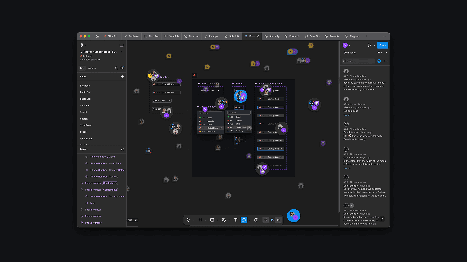
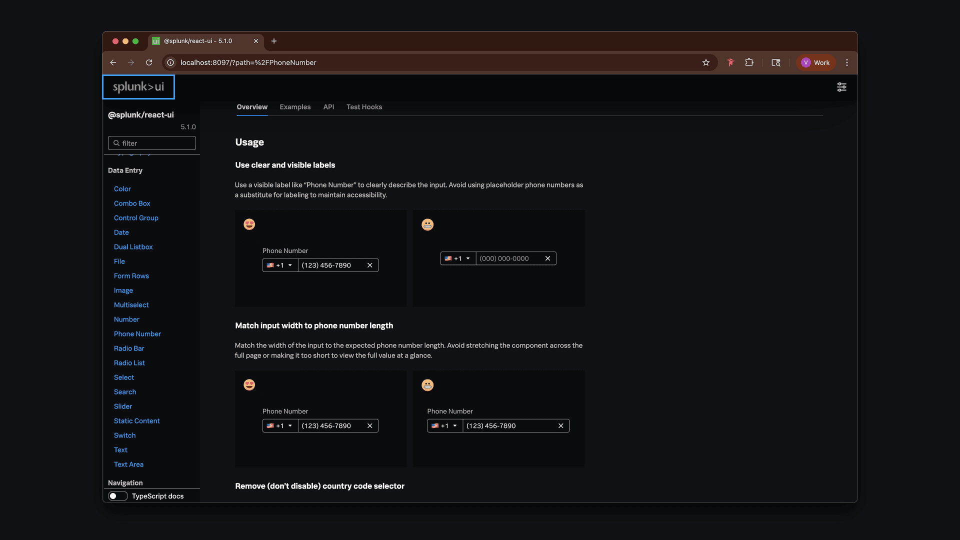
Once the design was finalized, I created an Overview Page in SUI. This documentation captured the component’s anatomy, states, and accessibility considerations, as well as do’s and don’ts.
Back
About
Lab
CONTEXT & BACKGROUND
Splunk needed consistency at scale.
Splunk is used worldwide by enterprise teams, but there was no standardized phone number input in its design system. Teams patched things together with third-party components that lacked flexibility, accessibility, and scalability — creating inconsistent user experiences and wasted engineering effort.
THE PROBLEM
Inconsistent solutions created inefficiency.
Without a single standard, every product team implemented phone inputs differently. Some used third-party libraries, while others built ad hoc solutions from scratch. These approaches were inflexible, introduced accessibility issues like poor keyboard navigation and weak screen reader support, and required engineers to duplicate effort. A unified component was clearly needed.
RESEARCH & DISCOVERY
Understanding needs through stakeholder interviews.
I began by interviewing designers and engineers across Splunk to understand how phone inputs were being used. The conversations highlighted consistent needs: a country code selector (with optional flag icon), auto-formatting to reduce errors, and strong accessibility support. Beyond features, stakeholders emphasized the importance of flexibility — the component had to adapt to different workflows without forcing workarounds.
DESIGN & ITERATION
Exploring multiple approaches and refining.
I explored and tested different approaches:
Split fields for country code and number (rejected for complexity)
Variations of focus states and dropdown behaviors
Different ways to display flags
Read-only and no-country-code use cases
Through iterations and critiques, I refined the design to balance usability, system guidelines, and technical feasibility.
THE SOLUTION
A standardized, accessible phone input for Splunk UI.
The final component unified functionality into a single, reusable design: keyboard and screen reader accessibility were supported by default, country code and flag options were configurable, and read-only and custom modes gave teams flexibility. Most importantly, the component was scalable across enterprise-grade workflows, ensuring long-term consistency in Splunk products.
REVIEW CYCLE & DOCUMENTATION
Creating clarity for adoption and scale.
The review cycle for this component was extensive. I presented iterations to designers across the team, who left detailed comments on edge cases, accessibility concerns, and usability trade-offs. Addressing this feedback forced me to think critically about every detail and ultimately helped me build a more robust, flexible component.
Once the design was finalized, I created an Overview Page in SUI. This documentation captured the component’s anatomy, states, and accessibility considerations, as well as do’s and don’ts.